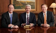
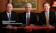
The February 2024 Liahona features an article by the Church News about how the work of the Presiding Bishopric can help members in their own lives and callings.
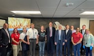
This week’s “Come, Follow Me” study guide includes a record of the Jerusalem Council in Acts 15. Today, Church leaders still meet in councils to make inspired decisions.